Drinks in the Library
A design refresh for a reimagined logo and website.
The goal wasn’t to start from scratch, but to elevate the existing design.
“Working with Paige was an excellent experience from start to finish.”
“Working with Paige Savino was an excellent experience from start to finish. She redesigned my logo for Drinks in the Library and revamped my website, and the results were a personalized, thoughtful and polished look that really brought my vision to life. She was easy to work with, kind, patient, and thoughtful throughout the entire process.
Paige was also very quick to respond whenever changes or alterations were needed, which made the process smooth and stress-free. I especially appreciated her kindness and positivity every step of the way. I highly recommend her to anyone looking for a talented graphic designer or website designer.”
-Gigi Howard, Drinks in the Library
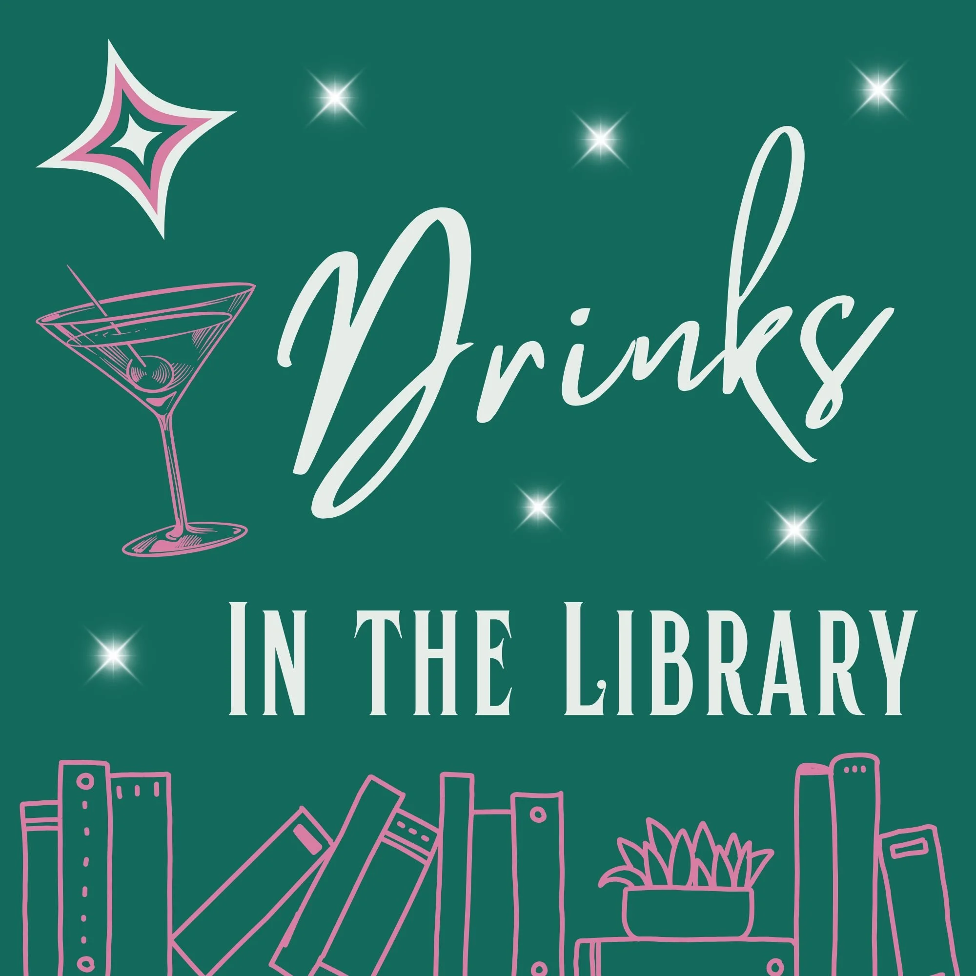
Logo (Before)
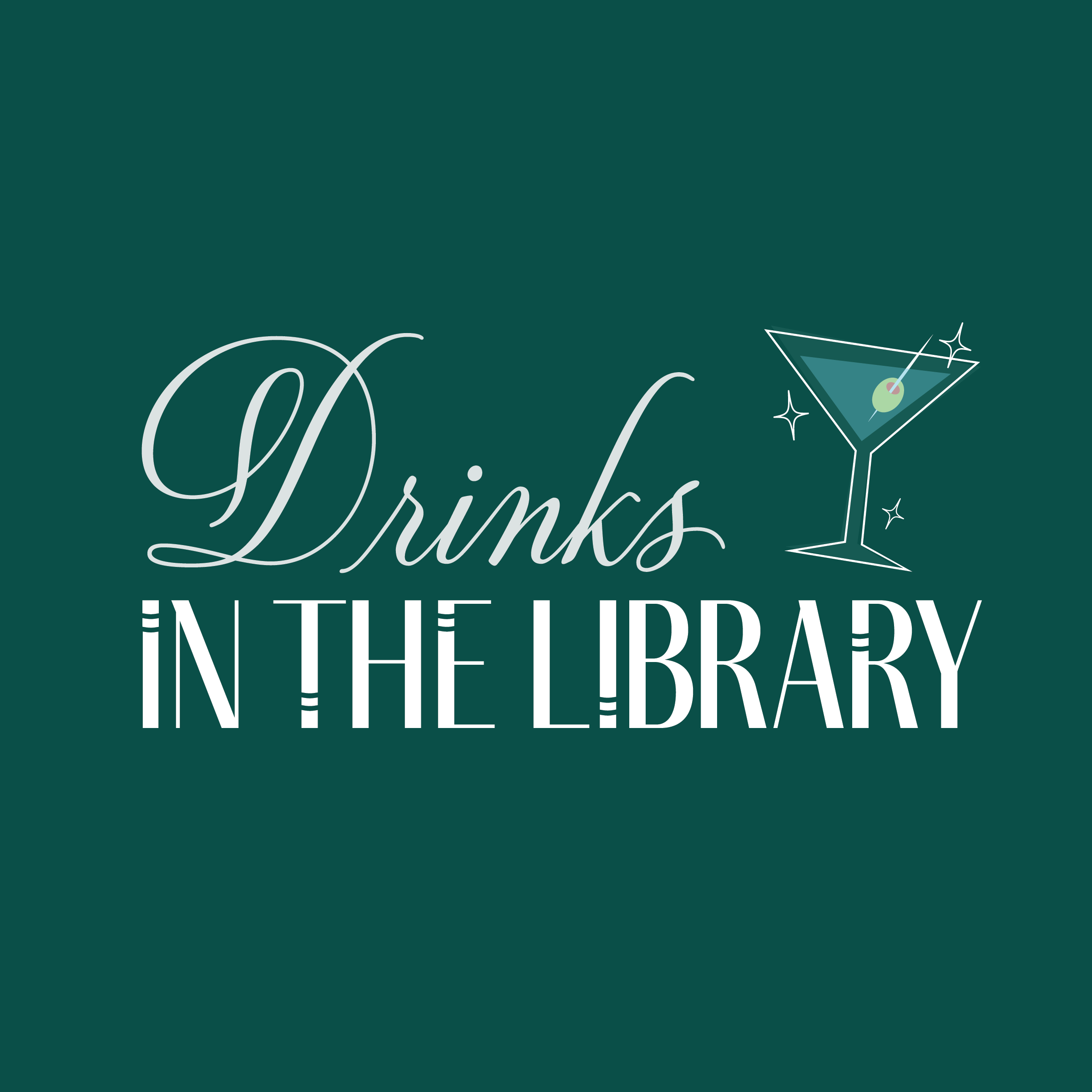
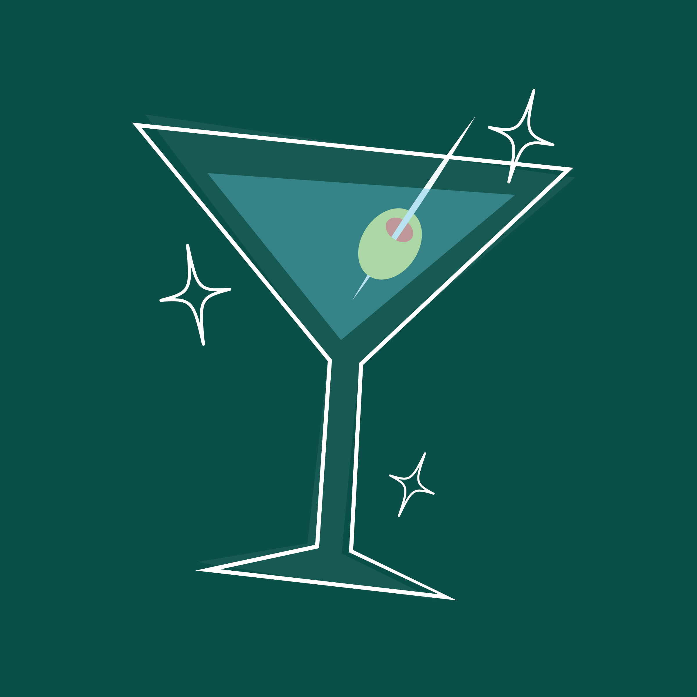
Logo (Redesign)
Design Elements
The Drink
The Library
The Sparkle
Drinks in the Library is meant to be a refined, classy podcast that combines the art of reading with the little taboo of having a beverage around books.
The glass tipped to the side adds an element of play coupled with the joy in the sparkle.
Integrating the books spines in the verticals of “library” allowed me to visually ground the logo in its foundation which is the conversation about books.
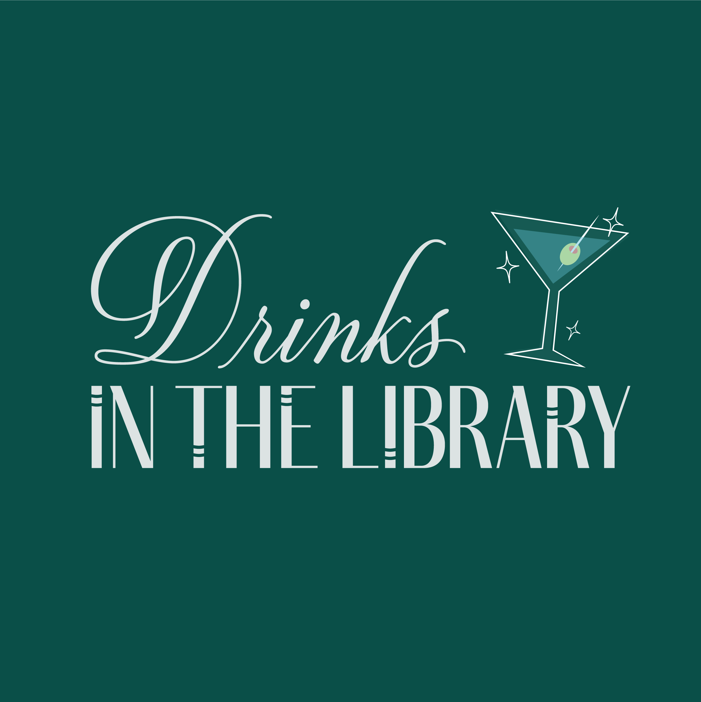
Logo Variations


Color Scheme
The Drinks in the Library logo had such a distinctive jewel-tone color that I wanted to be cautious to make any major changes. While ensuring continuity, I deepened the color to elevate the look and increase the contrast ensuring the design was more inclusive and visible.
I then opted for a monochrome palette with subtle color variations to create a mature, refined color palette.