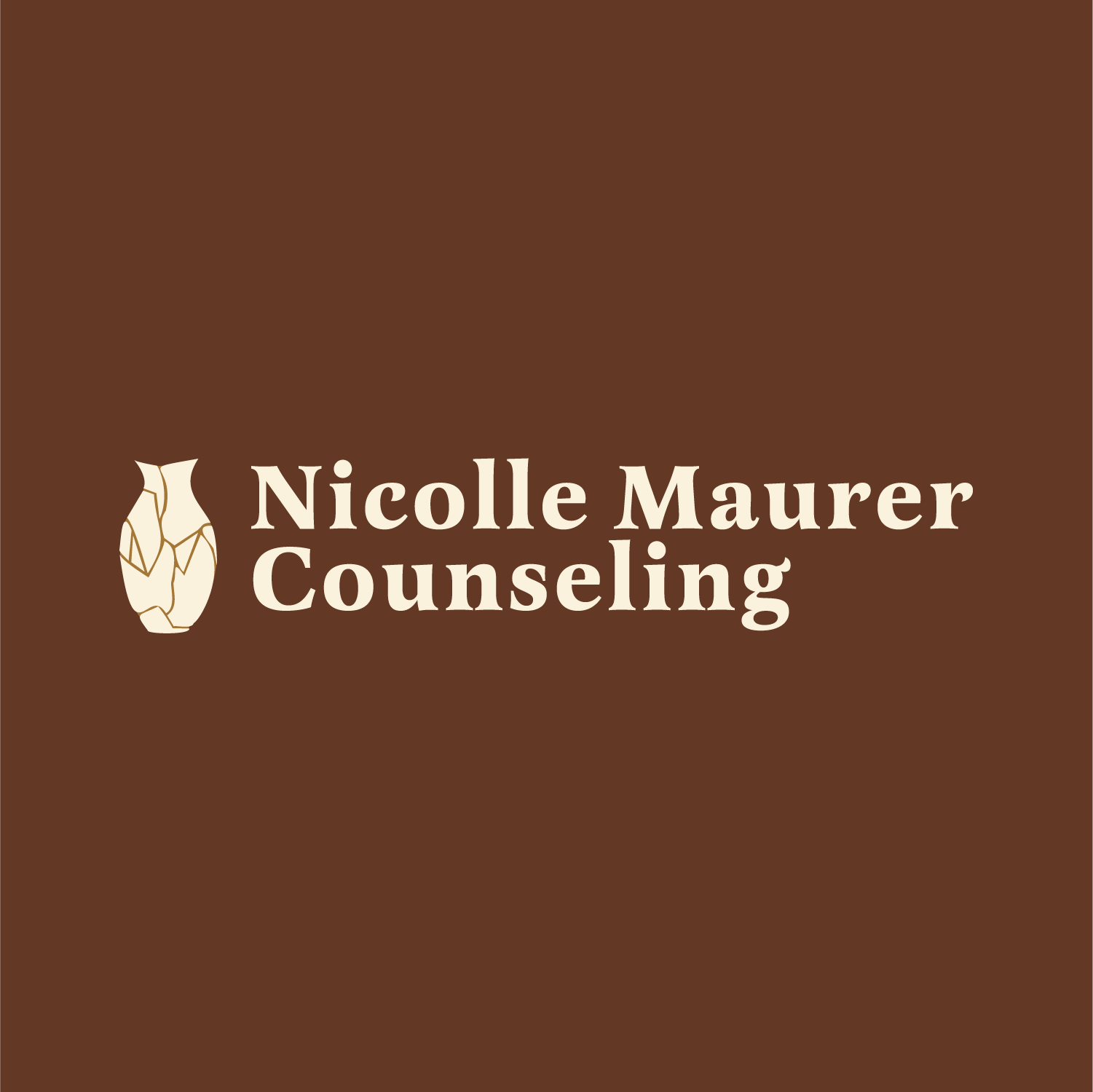
Nicolle Maurer Counseling
Logo & Website Design
The Logo
In our initial interview, I asked Nicolle how she wanted clients to feel when they came to her practice and she wanted to focus on: Human-to-human connection and to bring dignity, autonomy, agency to her clients.
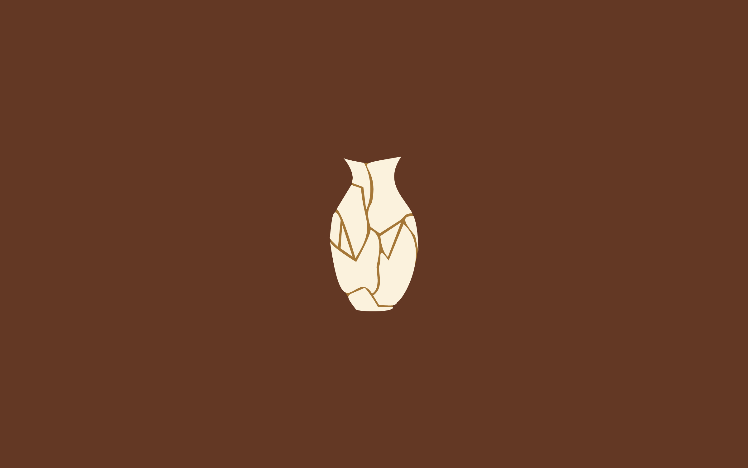
She wanted natural, timeless and clean design. She loved the idea of incorporating kintsugi into the design incorporating ideas of hardship and repair. Kintsugi is a Japanese art where broken pottery is mended with precious metals, especially gold. This draws on the Japanese philosophy of wabi-sabi which finds beauty in impermanence and imperfection focusing on the stories and history of the repaired piece.
In the vessel, if you look closely you can also see the letter NMC hidden in the cracks. I continued this theme on her site by using site dividers in gold.
Color Scheme
Many counseling practices use calming greens and blues, but we wanted Nicolle to stand out and to choose colors that suited her story.
Nicolle is an incredible warm and vibrant person, an Afghan adoptee, and an empathetic and active listener. I chose rich, warm colors complemented by a vibrant, living green. The cream exists to help give a contrasted color for text. The gold is there to represent the kintsugi as a minor design element.
Review
Paige has a keen, intuitive creative drive that infuses all her work with such life and beauty. She is a consummate professional.
I wasn't exactly sure what I even wanted for my logo but she got to know me as a whole person and incorporated such exquisite layers into my branding.
She made me feel seen and heard during the entire process and cared deeply about what I wanted.
Everyone who sees my website and logo now gives me compliments on it! I will be recommending Paige to everyone I know.
Nicolle Maurer