
StressLess Travel
When taking a trip, users have an abundance of information to manage: flights, lodging, rentals, transportation, activities, restaurants, and more.
Each plan exists in separate apps, notes, docs, emails and users are left switching between them all to manage the information. All of this work creates decision fatigue and stress that can leave users feeling like travel is a full-time job.
I designed a solution that automatically links emails and other travel accounts in one platform allowing users to view all their travel plans in one place, at a glance, so they can move through their trip with confidence. The overall goal was to reduce users' stress around travel planning and management.
My Role
UX/UI Designer, Product Designer, UX Researcher
Research
Mingfang Zhu, Jie Gao, Linan Zhang, Shenglang Jin,
Exploring tourists’ stress and coping strategies in leisure travel,
Tourism Management, Volume 81, 2020,104167, ISSN 0261-5177,
https://doi.org/10.1016/j.tourman.2020.104167. (https://www.sciencedirect.com/science/article/pii/S0261517720300911)

User Interviews

While the secondary research gave me a comprehensive look at different stressors that users can experience.
User Interviews helped define the ways that information management played a role.
Three main needs emerged:
• planning support
• managing plans during a trip
• addressing direct stressors

Assessment of Similar Apps
-
Wanderlog
Description: build, organize, map itineraries, free travel app, designed for vacations and roadtrips.
Issues:
• heavy advertising
• poor localization
• difficult to navigate
• constant recommendations -
TripIt
Description: Travel app that connects to email in order to create trip itineraries
Issues:
• have to email plans to TripIt
• confusing menu navigation
• paywall for pro features -
Other Apps
Many other applications in this space focus more on tracking business expenses. There’s a market for a friendly travel solution.
Ideation + Sketches
-
![]()
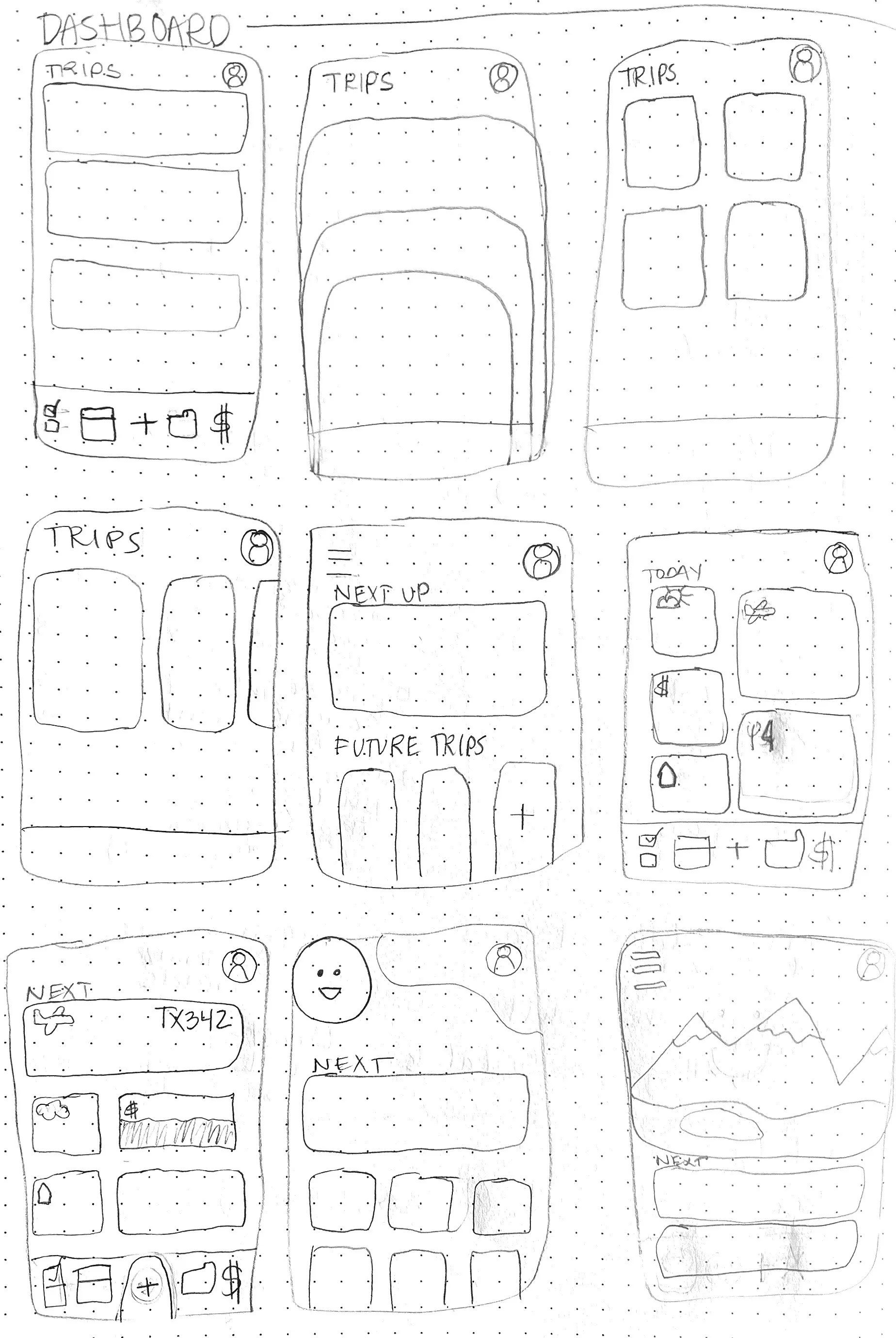
Possible home screens
-
![]()
Trip page sketches
-
![]()
Refined sketch of home page, trip itinerary
-
![]()
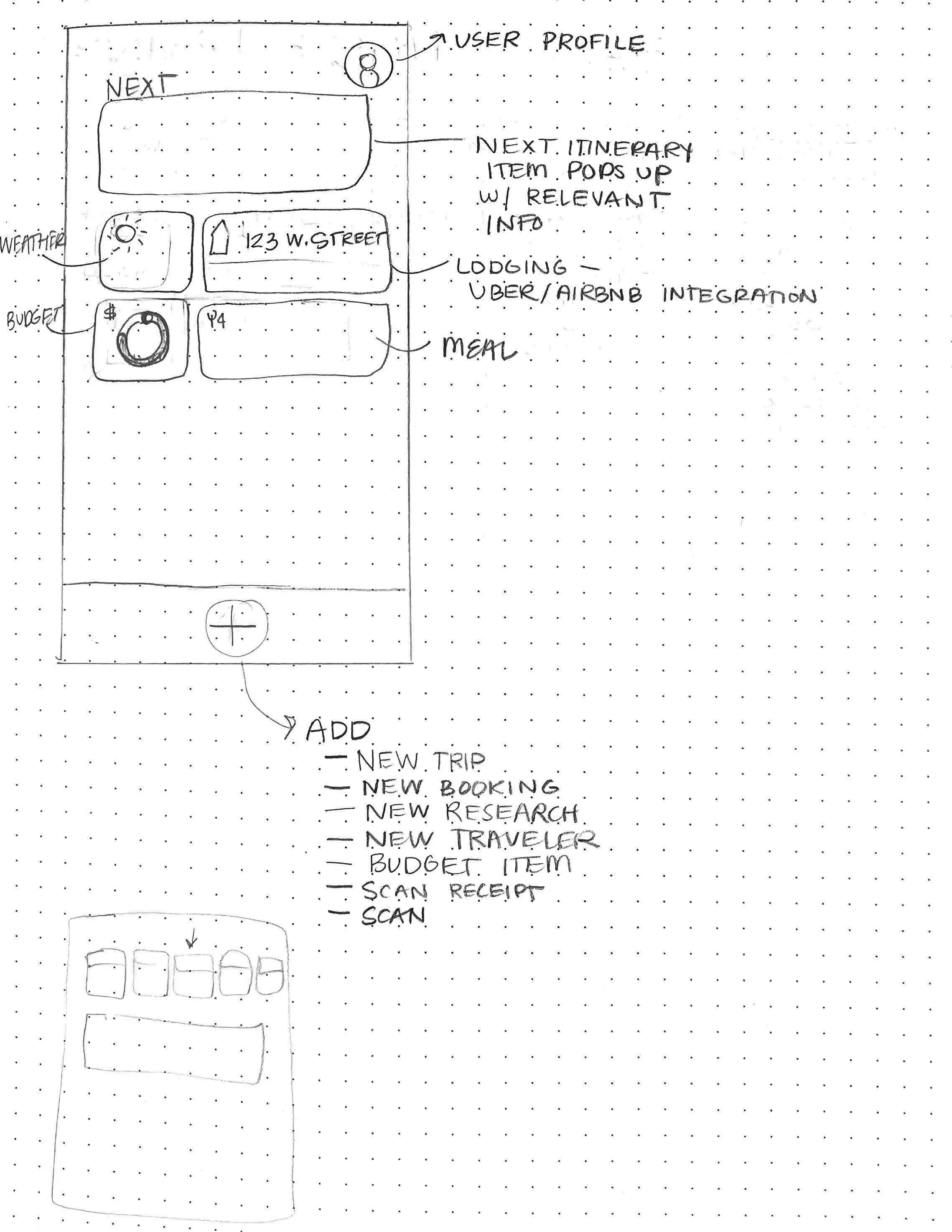
Problem solving "Add" button
Description goes here -
![]()
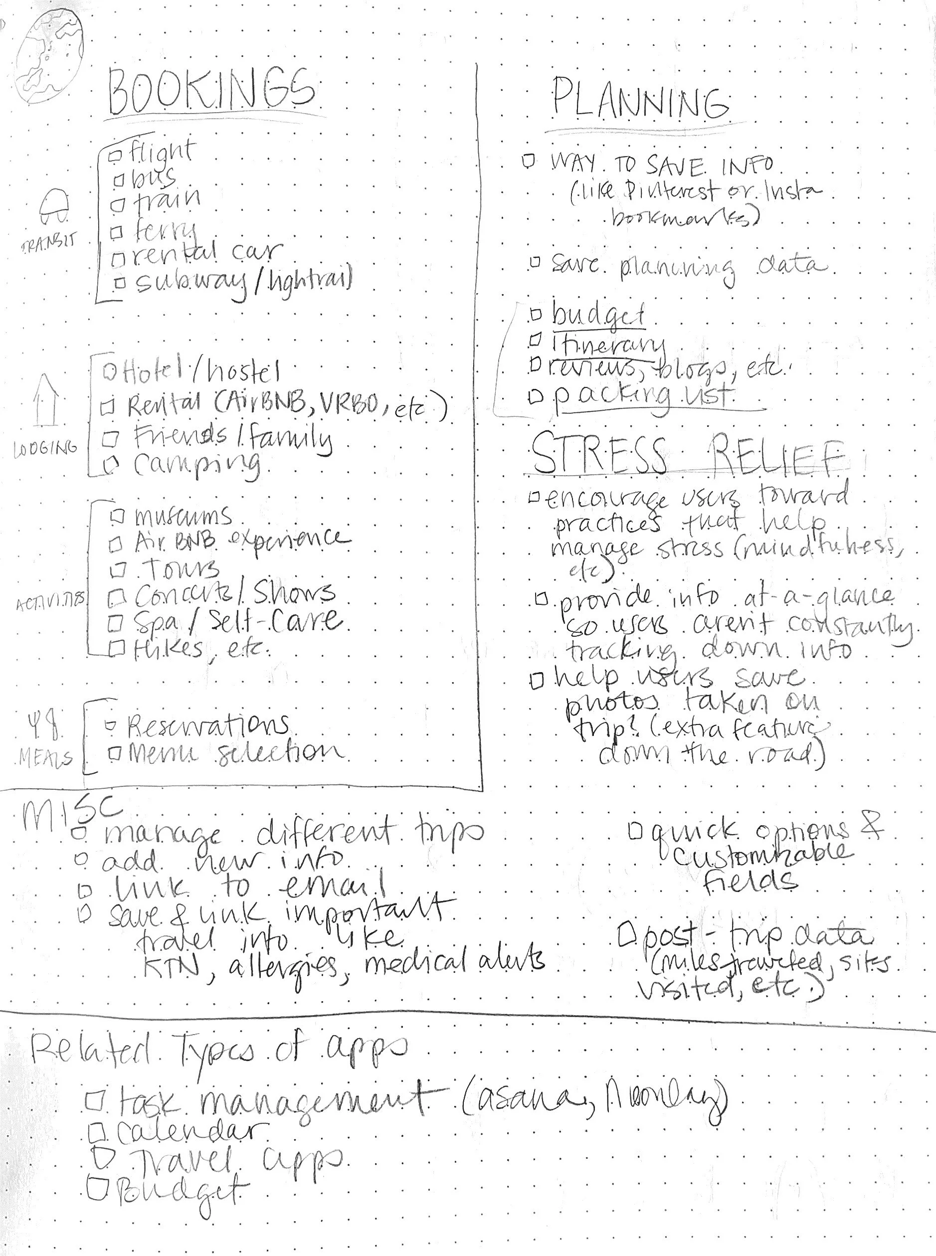
Problem solving content
As stated, travel is complex. This was my attempt to “brain dump" everything that came to mind.
-
![]()
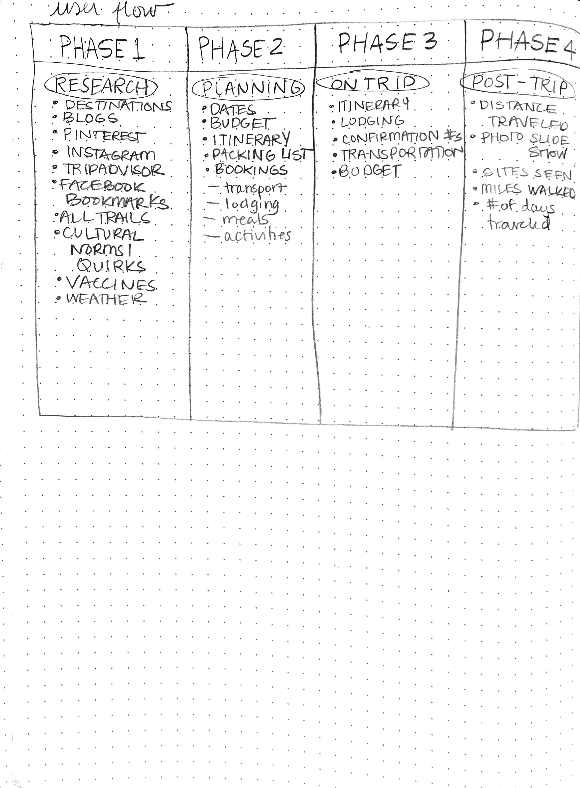
Trip Stages
I broke the trip into phases to help make this more manageable and to prevent project creep. As I worked, I prioritized phases two and three.
-
![]()
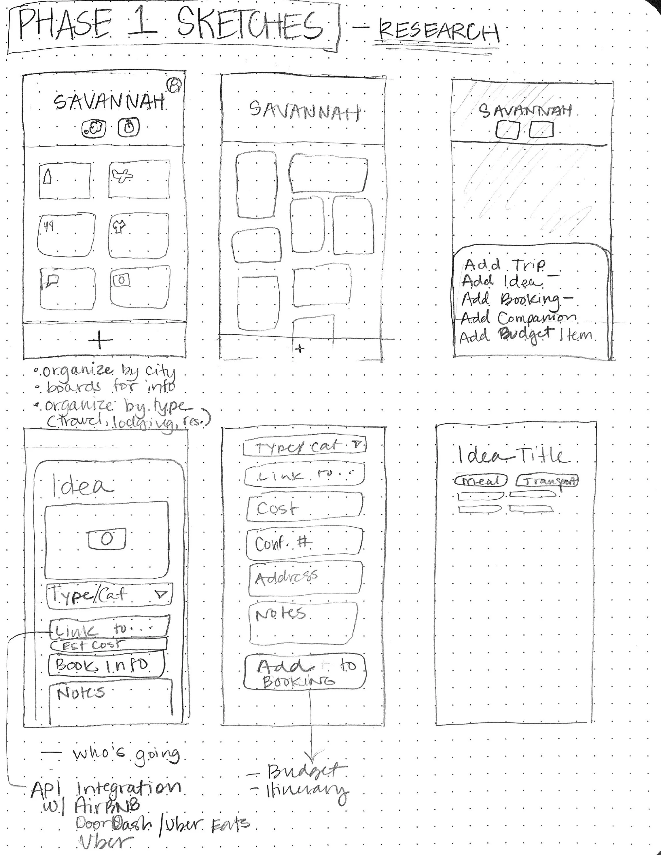
Phase 1 Sketches
-
![]()
Phase 2
-
![]()
Phase 3 Sketches
Description goes here -
![]()
Phase 4 Sketches
This was meant to be similar to a Spotify Wrapped, where users could quantify different elements of their trips.


User Stories

Wire Frames
-
![]()
Home page
-
![]()
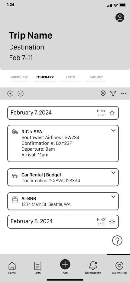
Itinerary
-
![]()
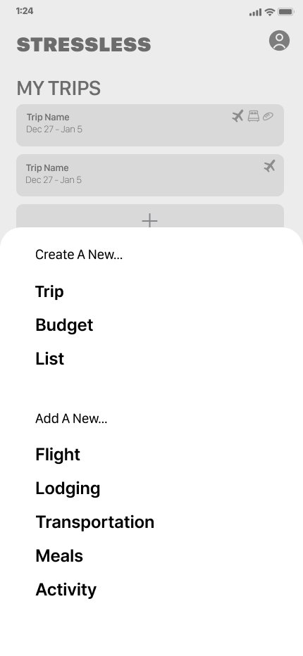
Add menu
-
![]()
Packing List
-
![]()
Budget
-
![]()
Add Flights


Wireframe Testing
Issues:
• Navigation Errors
• Language consistency
• Word choice (using language users understood)
Suggestions for future iterations:
• Sharing trip plans
• Adding others to trips
• Having access to all travel plans over different trips


Design Choices


Accessibility Audit
My initial designs didn’t have enough contrast between the background and foreground colors. So in my redesign, I created more contrast.
The second design is also more soothing due to the depth of color.
The design doesn’t rely solely on color but uses text and icons in order to communicate function.


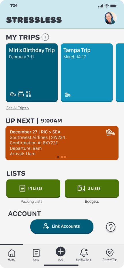
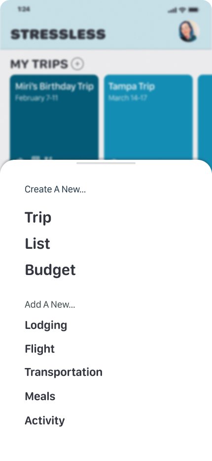
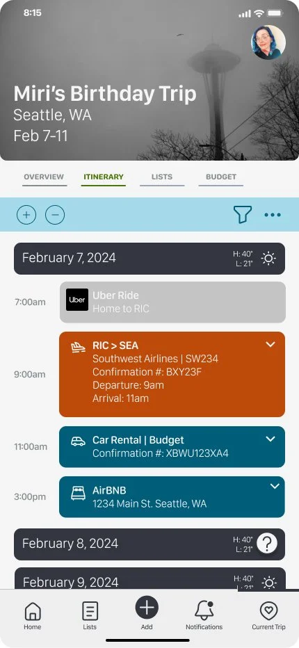
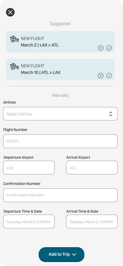
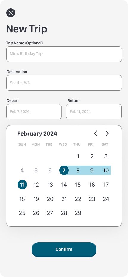
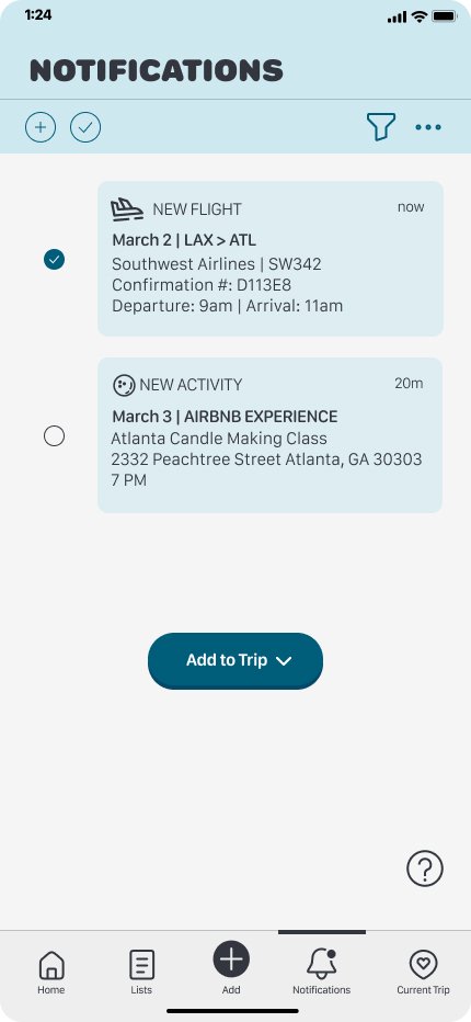
Hi-Fi Screens


Usability Testing
First Round
Major Pain Points:
• Difficulty locating “add trip” function
• Confusion with icons within the lists and budget sections
• Difficulty adding specific trip bookings
Addressing the issues:
• Created redundancy in adding a new trip
•Changing and clarifying the purpose of icons
•Adding a function for users to click where they expected
Second Round
Major Pain Points:
• Major Pain Points:
• Tutorial process too long
• Continued clarification of language
Reflection
User feedback was overall really positive. Most users stated they wished the app already existed. They enjoyed the use of color and icons, and overall had a very positive experience.
Lessons Learned
If I were to change one thing, I would add a share feature for users to invite others to participate in travel plans. I initially removed it to help with project creep, but I think it is an essential feature that people were looking for that was missing from this iteration of the app.